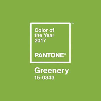
If you’re more on top of things than I am at the moment, Pantone’s 2017 Color of the Year is probably old news. I’m super excited about this year’s choice though! No offense Pantone, but last year’s colors were kind of bland… and essentially baby boy blue and baby girl pink. This year though, they’ve given us Greenery.

I happen to love green. I loved the year of Emerald (2013) and now we have Emerald’s fresher younger cousin!
If you happen to hate green, that’s cool. You’re not under any obligation to use or even like the Color of the Year (I pretty much ignored both of them last year…). What it means for the green-lovers out there though is that we should be see a lot of bright, springy green popping up in stores.
Here’s a like green inspiration to help kick off your year.

There is, of course, slapping that sucker right up on your walls! I love how they worked a gallery wall in with a bold color here. You need to be aware of the colors in the the art you’re using for it to really look polished with a bold background, but if you have a lot of black-and-white art it’s pretty much guaranteed to look smashing.

If you’re really gung-ho for green you can also just completely immerse yourself in it. If you’re going for a monochromatic palette, just make sure to bring in plenty of texture to keep it from looking flat.

Some people are afraid to bring color to their kitchen cabinets. I get it, it’s a lot of work to repaint it all and, let’s face it, color trends (and our own personal preferences) come and go. If you don’t mind the elbow grease, adding a punch of color to kitchen can look pretty amazing. Heck, if you have an island, just making that a bright focal point could really bump your kitchen to the next level!

Another one not for the faint of heart… Not gonna lie, painting trim is beastly! I can guarantee you I would never do this, but not because I don’t like the the look. I’d probably just change my mind before I ever finished painting and have to start all over again. I’m fickle like that. If you don’t want to redo all (or even a single room’s worth) of your trim, maybe just a door update. I happen to love me some bold front doors.

If cabinets and trim are too much work, but you’re lucky enough to have a claw foot tub, this is another way to colorize a fixture. Painting the exterior tub base is also super easy and can be done with just a little sample pot of paint!

You may have guessed by now that I’m kind of diggin’ the black-white-and-green combo. I think it’s fun and lively without being too in your face. Plus, green accents are easy to work in and switch out if you like to change up your decor periodically.

Green’s not just for stark black and white spaces. A nice neutral palette with some natural wood plus pops of green will make for a cozier space.

One of my favorite things about this year’s Color of the Year choice is that it’s even pretty awesome for color-phobes (don’t worry, I still love you). Even if you aren’t super into colorful walls or furniture or accessories, you may still enjoy plants! And like it’s name suggests, this is a color that really pulls from nature. Plus plants pretty much go with everything!

I actually LOVE this year’s color (maybe because everything is covered in snow here for most of the year?). My husband and I painted our lower cabinets bright green last spring – and I freakin’ adore them. They’re cheerful, easy-to-clean, and approximately 457 times better than the maroon/burgundy that they were when we moved in.
If I wasn’t entirely too lazy (which I am), I would slap some green on our doors and trim, too!