When we bought our house every room was “builder beige” (expect for the Brown Bathroom of Despair which was straight-up brown). You know, that warm, slightly off-white that’s like the go-to color when you want to remove all personality from a space?
Ok… that’s a bit harsh, but that’s often what realtors try to do when they’re selling homes–remove the existing personality so the future owners can better imagine themselves in the space. I get it… I think it’s unnecessary (although I’m a good visualizer so I may be biased), but I get it.
What I don’t get is living with a neutral color that isn’t working for you just because it’s “neutral.”
There are a million different flavors of “neutral.” You’ve got white, beige, gray, cream, and then assorted shades of each. Is it a warm or cool grey? Is it a yellow or pinky cream? The changes are subtle, but they can make a big difference.
Which is why the “builder beige” had to go in our house.
If you look at the rooms we’ve redone so far you can see there’s a decided cool (blue-green-purple) theme happening. A yellowy cream isn’t going to cut it. My personal favorite neutral is Benjamin Moore’s Paper White. It’s a slightly cool, pale gray–bright enough for low-light spaces (like hallways) but has enough contrast to make white trim stand out nicely. I knew we would be using a bunch of it in our house so I stocked up last year when Home Depot had their 4th of July paint sale ($15/gallon for Behr!!!!! and they can easily tint to BM colors).
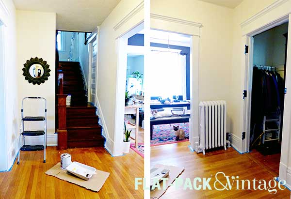
Before:

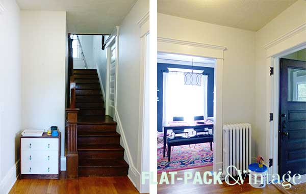
After:

Before our hallway was decidedly yellowy… it actually looked kind of dirty compared to rich blue-gray in the neighboring dining room. The after picture may be pretty subtle, but there’s a much more natural flow between the two rooms now.
If there are spaces in your house that are “builder beige” and you’re totally fine with it, go you! Just don’t talk yourself out of painting over one neutral wall color with another neutral wall color because you don’t think it will change anything.
Think about what your primary decorating color choices are. Red/Orange/Yellow are your Warm colors and Green/Blue/Purple (and usually Pink) are your Cool colors. If you’re using mostly cool colors chances are a yellowy (warm) beige may look a little out of place. If you’ve got a primarily warm palette happening than my choice of Paper White (cool) may not be for you. I also personally think earthier colors look better with creamy (warmer) neutrals, even if green is technically cool…. it all depends on the big picture.
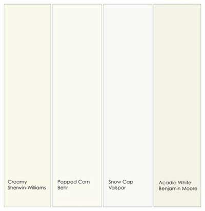
Warm White:

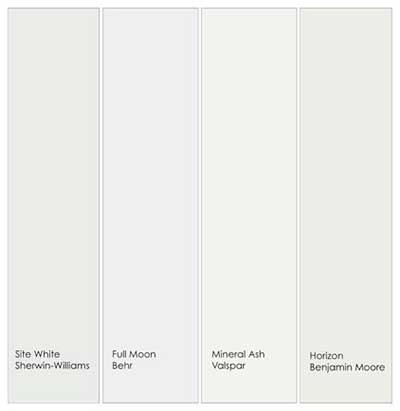
Cool White:

The Behr swatch section in Home Depot has very nicely labeled their whites by red toned white, yellow toned white, blue toned white, etc. If you’re somewhere that doesn’t have it spelled out (or you’re veering away from white), snapping a quick picture can make the undertones of a color really pop, especially if you get multiple swatches in the same shot, then you can directly compare them. And, of course, tape up the swatches you’re thinking of in the room so you can seem them in their correct lighting environment (and take another picture as the lighting changes). Picking up a couple sample pots once you have it narrowed down can be a huge help too.
